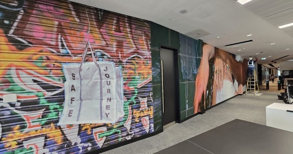

Office walls tend to sit blank for years. They get a coat of neutral paint, perhaps a clock or a framed certificate, and very little else. Yet walls take up more visual space than any desk, chair, or screen in the building, and leaving them empty wastes one of the simplest ways to shape how a workplace looks, feels, and functions.
Modern wall coverings and graphics change that. A single wall can now carry a company’s message, give teams a place to plan, and still look polished enough for client visits. Knowing which options suit which spaces helps business owners and office managers turn plain surfaces into walls that genuinely earn their place.
How Wall Graphics Make Workplace Walls Work Harder
Creative wall treatments can guide behaviour, support collaboration, and reinforce company culture, all from surfaces that are already in place:
1. Using Lettering to Share Company Values
Typography wall art turns words into a design feature. Mission statements, core values, or a short line that sums up the company’s attitude can be printed in large lettering across reception areas, break rooms, or meeting spaces. Staff see the message every day, and visitors get an instant sense of what the business stands for.
Matching the fonts and colours to existing brand guidelines keeps the lettering consistent with signage, websites, and printed materials. Large-scale text also fills wide walls without adding clutter, which suits clean, modern office layouts where heavy decoration would feel out of place.
2. Adding a Chalk-Ready Surface For Flexible Planning
A blackboard sticker gives any flat wall a chalk-ready surface without the need to mount heavy boards or frames. In kitchens and break areas, it works well for weekly notices, team birthdays, or lunch menus. Creative teams often use it to sketch rough ideas during informal catch-ups, where a casual surface encourages people to contribute.
The matte dark finish adds strong contrast against lighter walls, and it can be cut into custom shapes such as speech bubbles, brand icons, or simple panels. Because it peels away cleanly, it also suits leased offices where permanent alterations aren’t allowed.
3. Turning Meeting Room Walls Into Writing Space
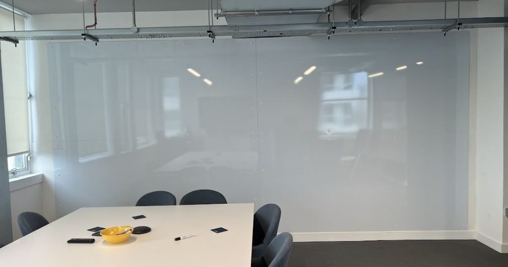
A whiteboard sticker turns an ordinary wall into a large writing surface for meetings, workshops, and project tracking. Teams can map out timelines, list tasks, or brainstorm at full scale, with enough room for several people to write at once. Unlike freestanding boards, it takes up no floor space and can stretch from desk height to ceiling.
Points To Check Before Fitting A Dry-Wipe Wall:
- Clean the wall to remove dust, grease, and marks
- Make sure the surface is smooth and free from flaking paint
- Measure the area carefully and plan the panel layout
- Set the height so people of different heights can write comfortably
- Keep it away from radiators and direct heat sources
- Stock dry-wipe markers suited to the finish
A properly fitted surface wipes clean easily and stays sharp for years, making it a practical upgrade for any room where ideas get discussed and decisions get made.
4. Creating Wayfinding Graphics That Guide Visitors
Large offices can confuse first-time visitors and new starters, especially when corridors and doors look the same. Wall graphics with arrows, room names, floor numbers, and department labels help people find their way without stopping to ask.
When these graphics follow the same style as the rest of the branding, they double as a design element instead of looking like an afterthought. Clear wayfinding also helps during busy periods, such as interviews, training days, or client events, when reception staff have less time to direct people around the building and every visitor needs to arrive on time.
5. Breaking Up Open-Plan Spaces With Zoning Designs
Open-plan offices can feel endless without visual cues to separate one area from the next. Wall graphics give each zone its own identity, so a quiet focus area looks different from a collaborative hub or a social space. Colour blocks, patterns, or themed designs signal how each area is meant to be used.
This kind of zoning helps staff settle into the right mindset for the task at hand. It also makes a large floor feel more organised and easier to navigate, while letting teams with different working styles share space without getting in each other’s way.
6. Supporting Wellbeing With Colour and Nature-Inspired Murals
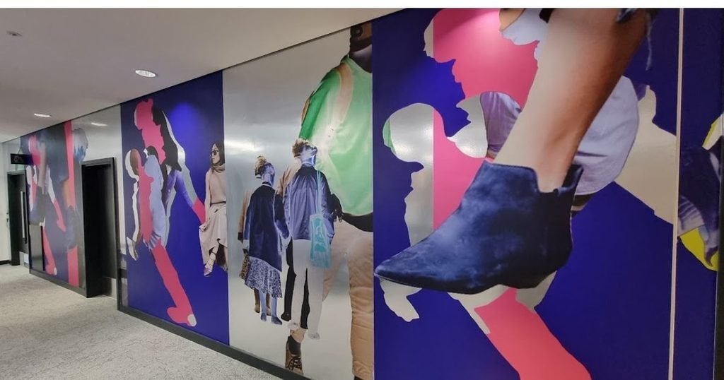
Workplace walls can affect mood as much as productivity. Murals featuring landscapes, greenery, or calming colour palettes bring a sense of the outdoors into rooms with limited natural light. Break rooms and wellbeing spaces benefit from this approach, since they give staff a genuine change of scenery during the working day.
Bright, energetic designs suit creative studios and team areas, while softer tones work better in spaces meant for rest or one-to-one conversations. Matching the design to the purpose of the room keeps the whole office feeling balanced.
Planning Walls That Suit The Way Your Team Works
Workplace walls have a bigger job to do than simply holding up the ceiling. With the right mix of graphics and functional surfaces, they can share company values, support planning and collaboration, guide visitors, and improve how people feel during the working day. Each option brings its own strengths, and the best results usually come from combining a few of them across the building.
Before committing to any design, it helps to look at how each room is actually used and what the team needs from it. A well-planned wall turns unused space into something people notice, use, and appreciate, giving the whole workplace a more considered and creative feel.